Why we need better UI in Professional Medical Devices
As a follow on from our previous blog, with more technology being used to treat patients, user interface (UI) design is key to making devices safe and effective. Patients aren’t the only ones who need good UIs however, Health Care Professionals (HCPs) are more reliant than ever on technology to do their job and this is only set to rise. They – more than most – need informative, error proof UIs especially considering errors kill 12,000 patients a year in the UK and no doubt cause complications for many more. Here are a few design recommendations tailored to designing devices with the needs of health care professionals in mind.
Know your audience
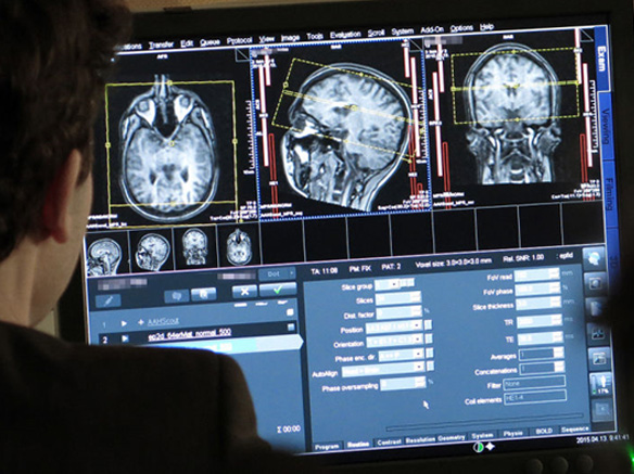
It is tempting to think that as you are developing a UI for professionals, background knowledge of the device is a given. This is somewhat true, however often the HCP using it may be an inexperienced nurse as opposed to a doctor. This is mostly dependant on what environment the device will be used in. If the interface is for a MRI scanner, it is safe to assume that those who are using it are trained in using the device. If the device is an infusion pump likely to be used by a large variety of staff; it is worth refining the UI so it’s easy enough for inexperienced users to understand too.

The Siemens MAGNETOM Prisma comes with a suite of compatible software allowing advanced clinicians to use the MRI scanner to its full potential. Image Credit: Gizmodo
Balance efficiency with the need for safety
As mentioned above, some of your users are more likely to be experienced using the device. These are people for whom efficiency and functionality are hugely important. As hospitals are often time sensitive environments, any advanced features to empower users such as keyboard shortcuts and interface customization should be embraced. Do not let task completion times become a top priority however. The human body doesn’t have an undo button, safety and error prevention should always be prioritized for medical UIs. Make sure users review settings before beginning a procedure and be sure to make the user check any inserted value that seems outside the expected parameters.
Be careful with error alerts
This is a tricky one. On the one hand if something is wrong with a device, a HCP should be informed immediately in case this poses a risk to the patient. On the other hand overloading HCPs with alarms can be just as dangerous. Alarm Fatigue is one of the biggest hazards facing the modern hospital and it’s easy to see why. Last year a single hospital recorded over 2.5 million alarms in a single month (and 88% of them were false positives). With this amount of alarms, HCPs can become desensitised quickly, especially when most of the alarms are ‘crying wolf’. When designing an interface, alerts and alarms should be thought about intelligently. Consider having different tones depending on the severity of the problem or sending a notification to a nearby HCPs smart device instead of having an alarm.
Consistency of information between devices
Ever noticed how most websites generally follow the same template these days? This is because we are more likely to navigate and understand a website if we have an idea of how it works. The same is true for medical devices. If HCP’s approach a device they haven’t used before, they will use their knowledge of existing devices to help them understand the new one. If there are conventions for this particular type of interface it is best to embrace them when designing your own.
Consider the context of use
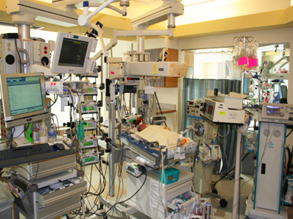
This is a more general recommendation. It is unlikely that your device will be used in isolation. Often it will be part of a larger hospital ecosystem containing other medical devices. A HCP may be able to operate an infusion pump perfectly well in isolation, but with a ventilator, a heart rate monitor and many others demanding attention, they may rush or overlook vital parts of the process. What happens if a user gets distracted mid-way through using a device and doesn’t complete the setup process? What happens if a user finishing a process is not the same one who started it? Observing users in their work environment will help you understand just how the devices fit into the broader system and work flow.

An intensive care unit for newborn babies. Try to imagine paying attention to all the devices in the above picture. Image Credit: Children’s hospital.org
As with patient medical devices, high costs, long development times and intense regulation means most healthcare companies can’t innovate at the same speed as the latest start-up, and hospitals can’t upgrade devices every two years like consumers (if the iPhone cost over $10,000,000 I doubt you’d be in a rush to upgrade to a 6s either). Change needs to happen however. In an industry that increasingly relies on technology, good user interfaces are vital for the future of healthcare.


